Election Projection Sites In Canada Are Still Awful
As I acknowledged in my day-after-the-election musings, I have been quite critical of Canada’s major polling companies in recent years, but they correctly pegged the results of the popular vote nationally. The same can not be said for the variety of sites trying to cash in on the trend of election projections kicked off by Nate Silver when his blog Five Thirty-Eight was still part of the New York Times. I’ve explained in the past why election projections in Canada are doomed to fail, and I think that analysis continues to be accurate. But let’s look at this particular election in more detail.
It seems likely nearly every day there was a new election projection site springing up during this campaign. I tried to ignore them, so I don’t know what most of them are. It’s entirely possible that one of them pegged the results properly; the more people making guesses, the greater the odds that someone will be right just by dumb luck. But I know of three projections that were relatively prominent. One is the Globe and Mail’s (Canada’s 2nd largest national newspaper by circulation), one is from the Laurier Institute for the Study of Public Opinion and Policy, and the other is Eric Grenier (better known for his Silver-aping blog title Three Hundred Eight).
Projections and Results
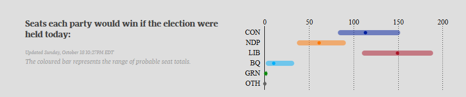
Here’s a comparison of Grenier’s projection to the actual results (image pulling directly from his site):
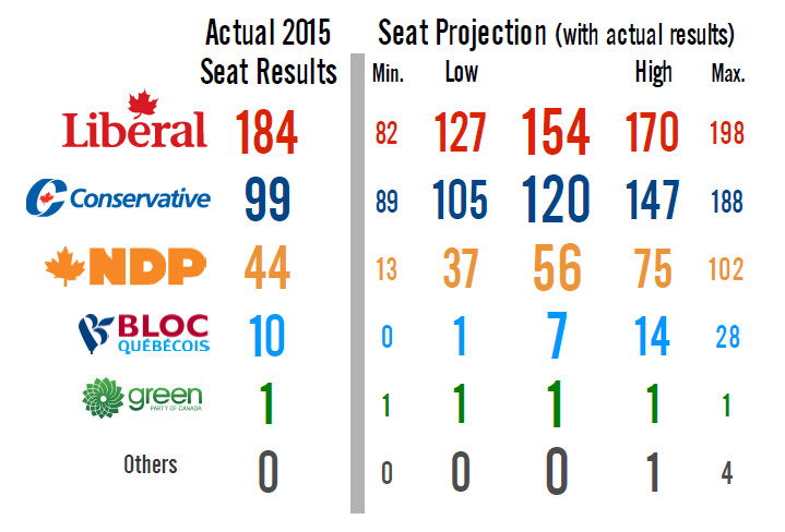
Yes, the results technically all fall within the bands he’s created, but the general performance is quite poor. The Liberals were considered to have a pretty narrow shot at the majority they easily claimed, while the Conservatives nearly undershot Grenier’s most pessimistic projection. Of the major national parties, only the NDP is in the high/low band, and even they’re closer to the outside than the middle.
And how about the Globe’s projection? (I could only get the page to load correctly if I was in private browsing mode. Not sure why.)
It’s hard to tell precisely what the range of the Globe’s projections are, but relative to 308 they look like they were a bit more pessimistic on the Conservatives and a bit more optimistic about the NDP. But the general projection is similar: strong likelihood of a Liberal minority. The projection still mostly fails. I think you could argue that the Globe’s projection was close enough on the Conservatives, but it pretty significantly over-estimates where the NDP would wind up, while the Liberals are almost at the outer range of their projection.
Finally, let’s look at Barry Kay’s projection at LISPOP:
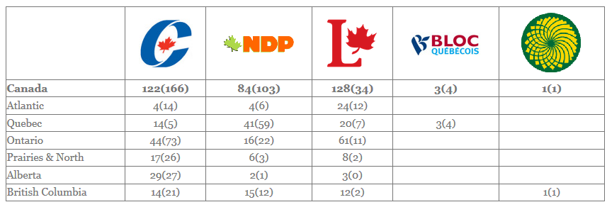
Again, way off. LISPOP performed the worst of the three projections, calling a very small Liberal minority government.
You could argue, as I’m sure some people will, that it’s baked into a probabilistic projection that the outcome could be outside the most likely result. Indeed, that is precisely the point of suggesting a range. And yet surely there must be some limit one what how big of a range actually provides us with useful information.
Grenier’s projections are so broad that pretty much any result other than an NDP majority would have theoretically been within their bounds. The Liberals won 124% more seats than the 308 “minimum”. At the other end of the spectrum, the NDP’s projected “maximum” was 132% higher than their actual seat count, while the CPC’s maximum was 90% higher than their result. A forecast that can be off by that much and yet still technically be within its own bounds is not providing useful information. Further, it’s nearly unfalsifiable, given the range of possible results it encompasses.
[Aside: I did a search to try to find some of the projection sites I wasn’t familiar with. The ones near the top of Google’s results performed horribly, but I’m not going to analyse them in any detail since I have no idea if anyone was paying any attention to them to begin with.]
Some Analysis
A projection is only useful if it tells us something we couldn’t easily figure out at a glance; if it provides some increased explanatory power over simple guesswork or observation. Yet the only thing the forecasts told us that they essentially got right – that the Liberals seemed to be in the lead – was easily discernable without recourse to a complicated statistical model. On the main substance of their projections – Liberal minority with the Conservatives not far behind – they were wrong, and wrong by quite a bit.
People defended election projection sites after previous elections on the grounds that it wasn’t their fault the polling data was unreliable. But now we have an election where the major pollsters were, both individually and in aggregate, pretty much right on the money, and the models still failed to perform. So now the argument that the data is failing the models is no longer tenable. It’s clearly the models themselves that are faulty.
[Aside: I never bought the argument that it wasn’t the fault of projections that the polling data was poor. A model that might theoretically be useful under conditions that don’t exist provides us with no real information. and it’s essentially untestable. If the conditions to accurately forecast don’t exist, the obvious conclusion is that you shouldn’t forecast, not that you should forecasti in a predictably inaccurate manner and then complain it isn’t your fault.]
So why did the projections all get it so wrong (and, just as importantly, why was this so predictable)? While the three forecasts have their own particular methodology, all of them are based on something called the regional swing model, which was first developed for British elections. If you want a more in-depth discussion, Barry Kay, a political science professor at Wilfred Laurier University who helps run LISPOP, has written an academic paper (PDF) about his method.
In a nutshell, the idea of the regional swing model is that you look at how a party is performing in the polls in a given region (like, say, Ontario) relative to how it performed there in the previous election. You then apply the shift within that region to the results of the previous election for all the ridings in that region in order to predict who would win in each individual riding, thus coming to a final seat count.
I think it should go without saying (though clearly it doesn’t) that this isn’t a particularly good way to project elections in a parliamentary system. The electorate in downtown Toronto, for example, differs dramatically from the electorate in Toronto’s suburbs; this is widely known and is the basis for much of the discussion about Toronto mayoral races. The electorate in the Kitchener-Waterloo region is pretty dramatically different from the electorate in northern Ontario. The electorate in Montreal differs sharply from the electorate in and around Quebec City. And so forth.
As I’ve said in the past, nation-wide poll aggregation simply doesn’t work in an election in which representatives are selected in 338 separate riding-by-riding elections. Ridings differ on a lot of levels, and you just can’t predict such narrow results with such a broad data set. Ultimately, there just isn’t good enough data to do election projections in Canada using poll aggregation. The problem isn’t that the models need to be improved; the problem is that you fundamentally can not do what the models are trying to accomplish.
A New Contender Has Emerged
If you can’t do election forecasting for Canadian federal elections using poll aggregations, does that mean you can’t do them at all? All I could say is that I have not yet seen a method that looks promising. That doesn’t mean that no one will ever come up with one, it just means that I haven’t seen it.
Except.
Something interesting happened in this campaign. Using nothing other than search trends in Google at the end of the campaign, Maclean’s business writer Jason Kirby was able to come significantly closer to the actual result than any of the forecasts using more complicated models.
Let’s try that again: fwiw, extrapolated from latest Google search interest LPC 189 CPC 108 NDP 34 Green 7 #canadianelectionguesses
— Jason Kirby (@jason_kirby) October 19, 2015
I asked Kirby to clarify how he came to his result, and he said he simply apportioned seats based on what % of the search volume each party got. Dirt simple. Surprisingly effective. But the real question: is it actually a good method?
I don’t know. You would have to test it against a bunch of elections and see how reliable the results were. It’s possible that this is just a fluke; as I said above, given a sufficiently large number of people doing projections, someone is going to wind up being right by dumb luck. It’s also possible that the particular conditions that made it work this time won’t be present in other elections. And this method certainly has some of the same problems as the regional swing model (it could easily miss large regional concentrations which are not reproduced nationally, for example).
But even if this particular method isn’t great (ie. just apportion seats proportional to national search volume) I think in general there are reasons to believe the data collected through Google’s search engine could prove to be more useful than poll aggregation.
One reason for this is that it’s much harder to lie to Google than it is to lie to pollsters. If you get a phone call from a polling company, you can give them pretty much any answer(s) you feel like, and there’s not really much of a way for them to check your answer for accuracy. But when people search for something in Google, it’s almost always because they have some actual interest in that topic. Peoples’ search history is reflective of things about them that are essentially true (this is part of what makes it so creepy that Google saves your search history forever and can do their own analysis on it).
Another benefit to using Google search data is that the sample size is huge. An overwhelming majority of Canadians use the Internet. In 2014, 87% of Canadian households had an Internet connection. The number has presumably gone up since then, and even Canadians who don’t use the Internet at home may use it in public libraries or other community locations. This makes Google search data very valuable, as it is based on a large sample size, and that entire sample is subject to the same methodology.
You might complain that Google searches are among a self-selected sample, and that skews the result. However, I’m not sure that’s a problem in this case. Voters are a self-selected sample. The people who will be most motivated to search for info on political parties and/or candidates, especially in the final days of a campaign, will be people who intend to vote. Polling agencies already often split out respondents who are “likely to vote” from their full response set and report those results separately. This is a fairly similar principle.
It’s may be unlikely that Google would make data available at a sufficient granularity to allow for more precise projections. But that wouldn’t necessarily stop Google’s own researchers from trying to come up with a projection, similar to how they used to use search data to predict upcoming influenza outbreaks. It is, at any rate, an avenue of research that I think is likely worth investigating, and one that has much more promise than national poll aggregation.